My role
Product Design
Discovery
Mapping and understanding workflows
User Interviews
Stakeholder interviews
Maintain tight user feedback loops
Team 2 des, 4 devs, 2 BA, 1 PO
Client
H&M
Duration
2.5 years
A next-gen visual tool for creative teams to plan, present, communicate and share the collection
H&M’s existing tool for creating and sharing designs and collections had become outdated and cumbersome, no longer supporting the scale or needs of its users. The strategy was to decommission it and replace it with two purpose-built applications designed around specific user workflows.
I led the design of one of these new tools.

Project highlights
Cut down document creation time in half
The new UX and feature set helped users doubled their speed and cut down document creation time in half.
Achieved 100% adoption, despite being optional
Even with an optional rollout, the new app achieved full adoption — 100% of users voluntarily switched from the legacy tool.
Improved performance & loading speed
The new app vastly outperformed the old one in speed and reliability. Loading times of large documents also improved.
Contribution to enterprise design patterns
Enriched the H&M component library.
Increased user
satisfaction
Users were happy with improved workflows, faster speeds and the nicer finishing look of their documents.
Better accuracy and operational efficiency
Providing continuous access to live data streamlined collaboration, decreased errors, and drove gains in operational efficiency.
Tight loop between user feedback & implementation
Short time between customer feedback and implementation meant user requests were catered to quickly
01.
Project Context
THE PURPOSE
The application was built to modernise how creators document garments and collections, enabling seamless presentation and sharing across teams. At the heart of the vision was a shift toward centralised, live data powering every step of the workflow.
THE USERS
Creators
Users who generate documents to communicate details, context, or decisions to their intended recipients (receivers).
Receivers
Users who receive documents from creators and use them as inputs to their work.
02.
Understanding the project landscape
Stakeholder interviews, mapping, use cases, company strategy
Collaborating closely with a strategic designer and researched, we conducted a comprehensive research phase that included stakeholder interviews, mapping user flows and workflows, analysing use cases, and aligning with the company’s broader strategy. We also dug into the document outputs and uncovered key user pain points and needs.
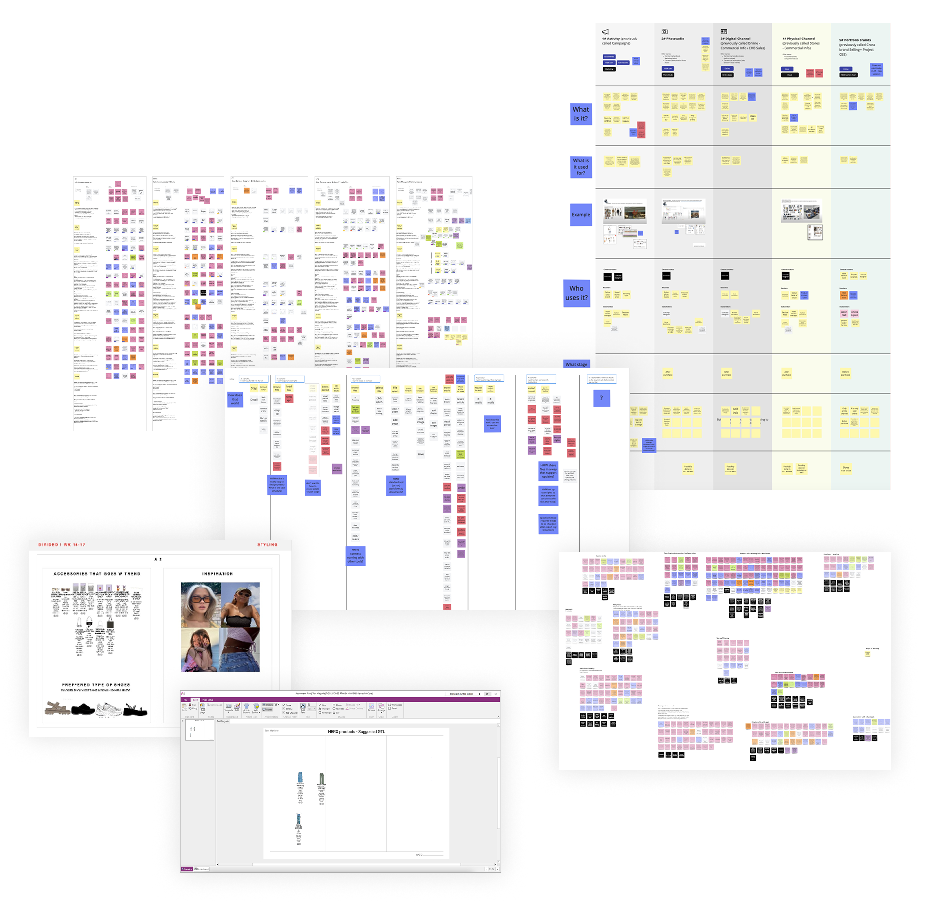
Based on our comprehensive research, we identified several challenges on both the user and strategic organisational level. With 3 of the most important ones.
03.
Identifying and reframing
the most important challenges
Exported documents did not have live data and could not be updated
Exporting to PowerPoint or PDF broke the link to live updates, creating constant back-and-forth and wasting a lot of time.
CHALLENGE 01.
How might we connect creators and receivers, while keeping data live and updatable?
The old tool’s poor UX caused frustration and lengthy document creation times.
Lack of modern supporting tools, poor experience in individual features such as the Article Browser and broken features increased document creation times.
CHALLENGE 02.
How might we speed up document creation while letting users focus on creative matters?
Outputs appeared unpolished, requiring users to spend excessive time on styling.
Lack of standardised typography, sizing and colours led to inconsistent, unprofessional documents and wasted time on formatting instead of focussing on meaningful work..
CHALLENGE 03.
How might we standardise documents while still keeping things flexible for users?
04.
Solution
A web-based, live-data whiteboard document builder that automates tedious formatting and alignment tasks, speeds up creation, reduces errors with live data, and lets users improve and increase their output.
Receiver mode with live data
to connect creators and receivers in one app
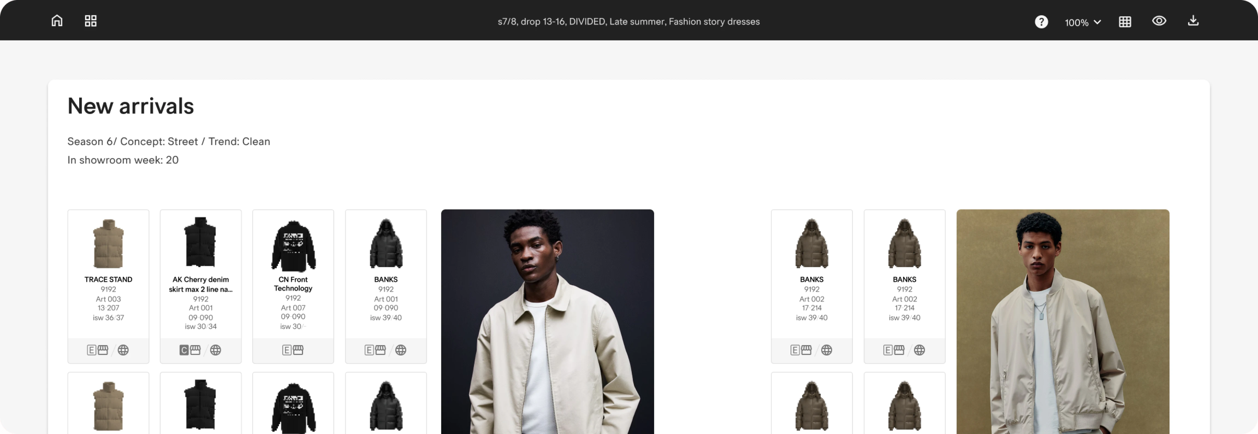
Eliminating the need to export to PPT/PDF that caused dead data
By getting receivers into the application as well, there was no need to export a static dead document. All data would now be available live in receiver mode.
Live updates for any changes made by creators
Any updates made by creators would be immediately visible to receivers, thereby cutting out back and forth between creators and receivers.
Receiver view mode with no edit access for live data
Receiver mode would not have edit access unless those receivers needed it. Keeping documents safe and tinker proof for use by multiple users.
05.
Setting up the tools framework
EXPERIMENT 01.
Experimenting with tools on the left, providing for an unintrusive vertical scroll
The aim here was to maximise vertical screen real estate especially for smaller laptops. By providing tools on the left, there would be more space on top for the board.
EXPERIMENT 02.
Experimenting with tools on the top
The aim here was to lean on users familiarity with the old app and the built up eye and muscle memory and habits to reach out to the top to look for tools.
EXPERIMENT 03.
Experimenting with tools as a popup, providing for a cleaner board
The aim here was to hide some tools and maximise the space on the screen and aim for an entirely keyboard based input. One shortcut to trigger the popup and typing in the name of the tool they wanted, similar to Notion.
TEST RESULTS
Users had a strong preference for familiarity of the old app and tools on top.
06.
Setting up the basic elements
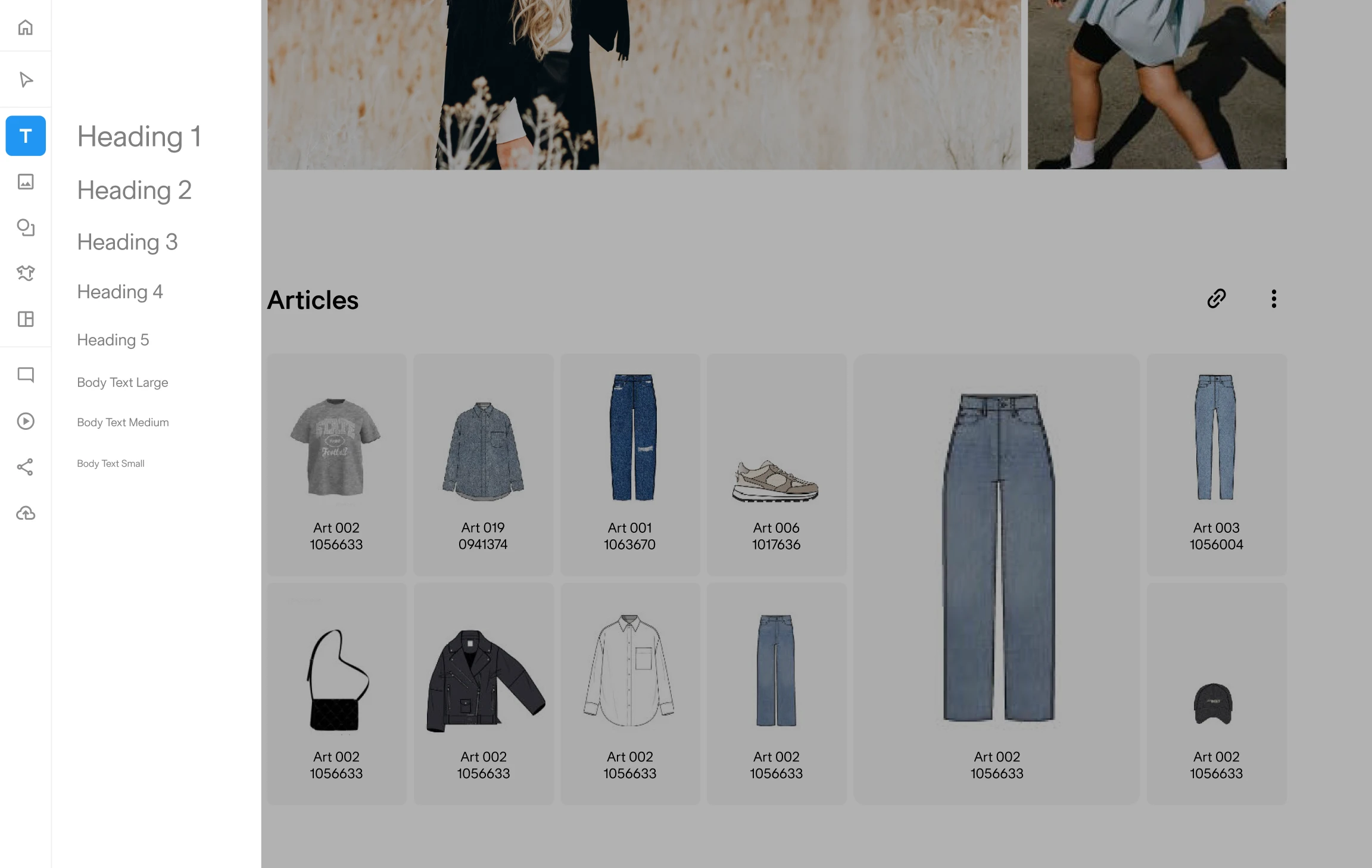
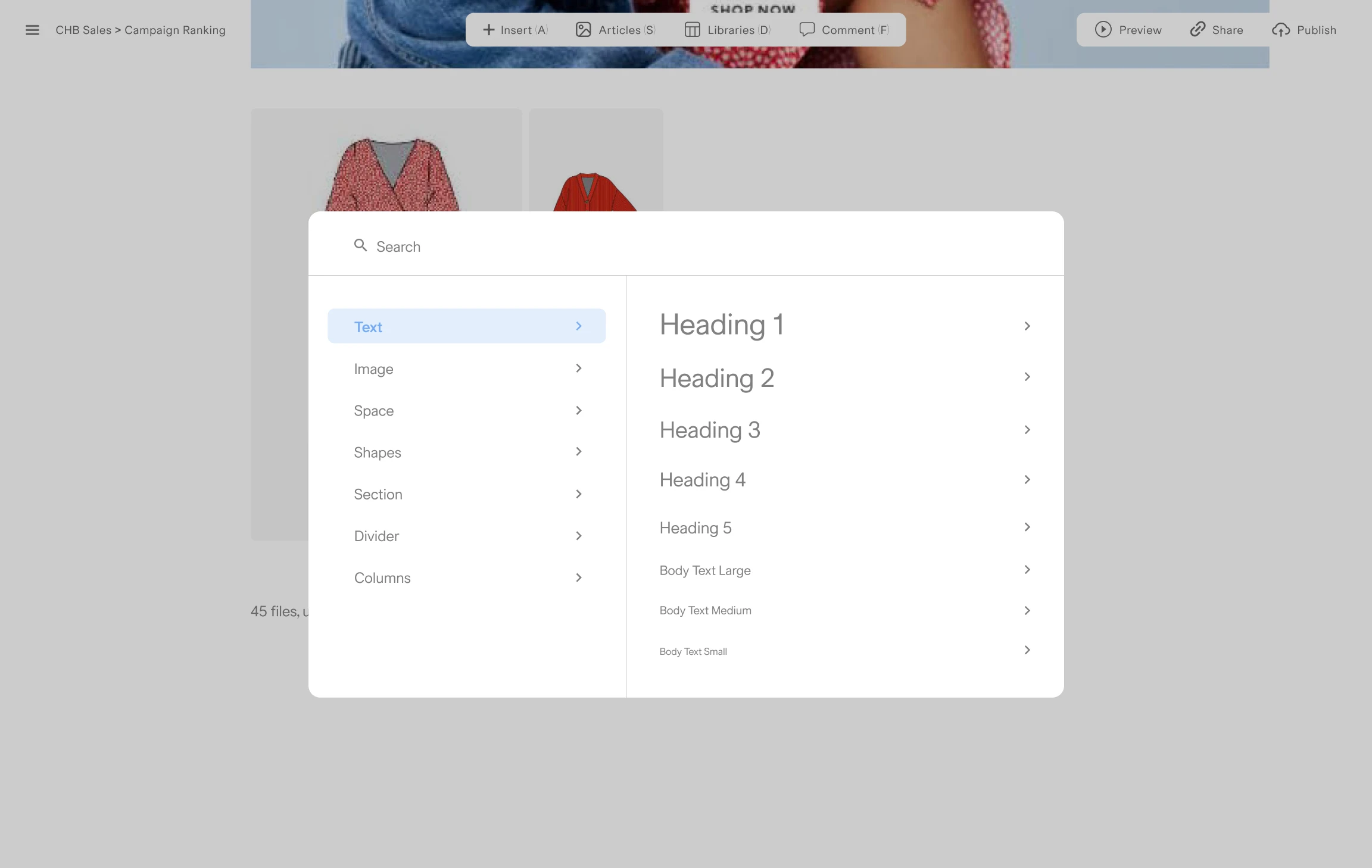
The four elements that make up boards
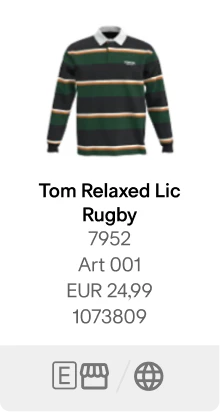
Article card
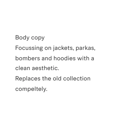
Textbox

Image

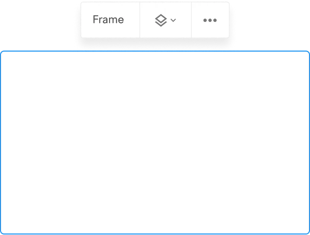
Frame
Consistency in interactions
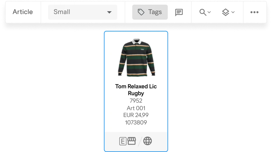
Article card
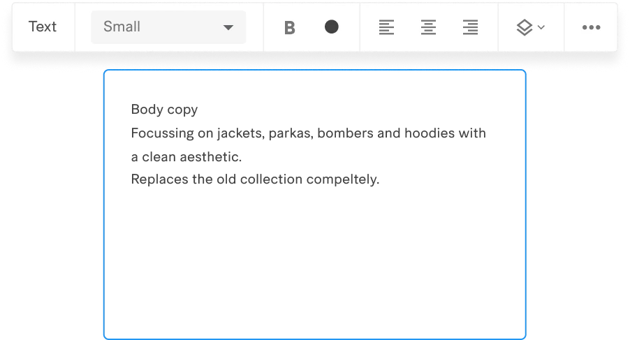
Textbox
Article card
Textbox
Cursor feedback for inserting elements

Article card (s)

Textbox

Image

Frame
07.
Facilitating faster document creation
with helpful features
01. Snapping dotted grid for easier alignment
and less manual work
Helping move elements around, and making snapping and aligning easier
02. Smart alignment that clusters
all selected elements together
03. Cutting time spent on finding extra information
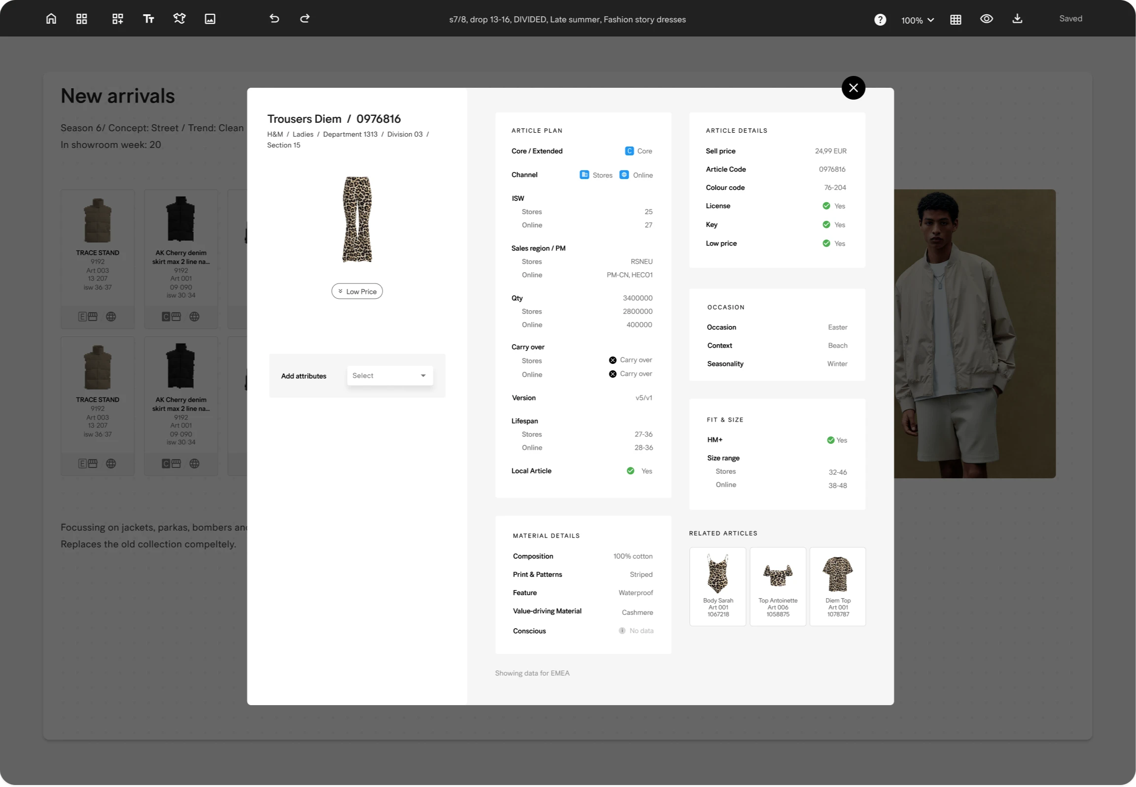
Bringing extra information in Compass, only visible when needed
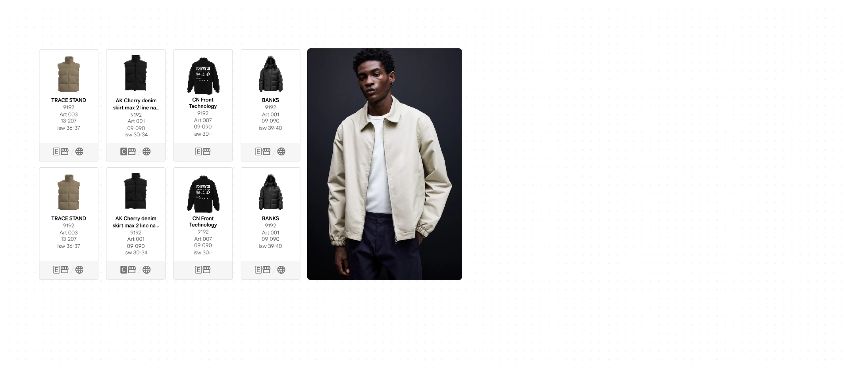
Because the article card showed only basic details, users frequently had to jump to another internal tool for more information. We solved this by creating an expanded article card with deeper, consolidated data.
Integration with other tools in the client’s organisation
Some information still lived in other internal tools, even after introducing the expanded article card. To eliminate friction, we integrated with those systems and added a direct search action, allowing users to look up an article instantly without manual copying.
08.
Standardising sizing and colour options
for a unified look across docs
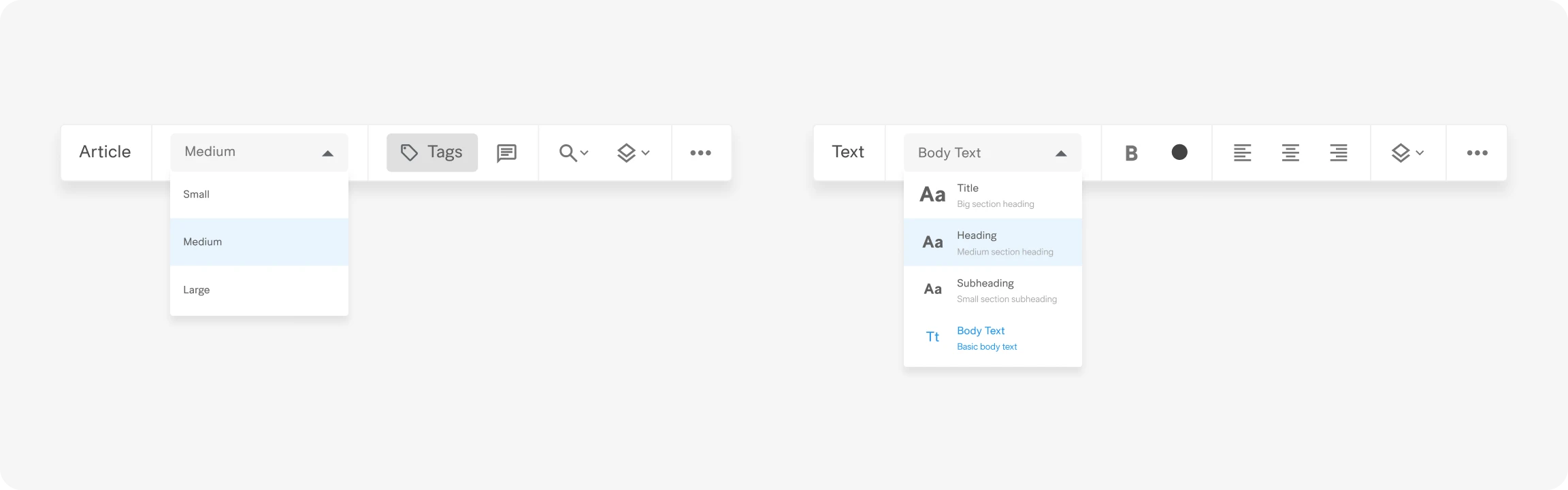
Standardising sizes to let users focus on building a collection than being obsessed with sizing, formatting and styling
To bring consistency to documents, we standardised key elements such as article cards and text into a small set of predefined options. Paired with controlled fonts and colours, this ensured creators produced clean, professional-looking outputs, no matter who the creator was.
09.
Redesigning the Article Browser -
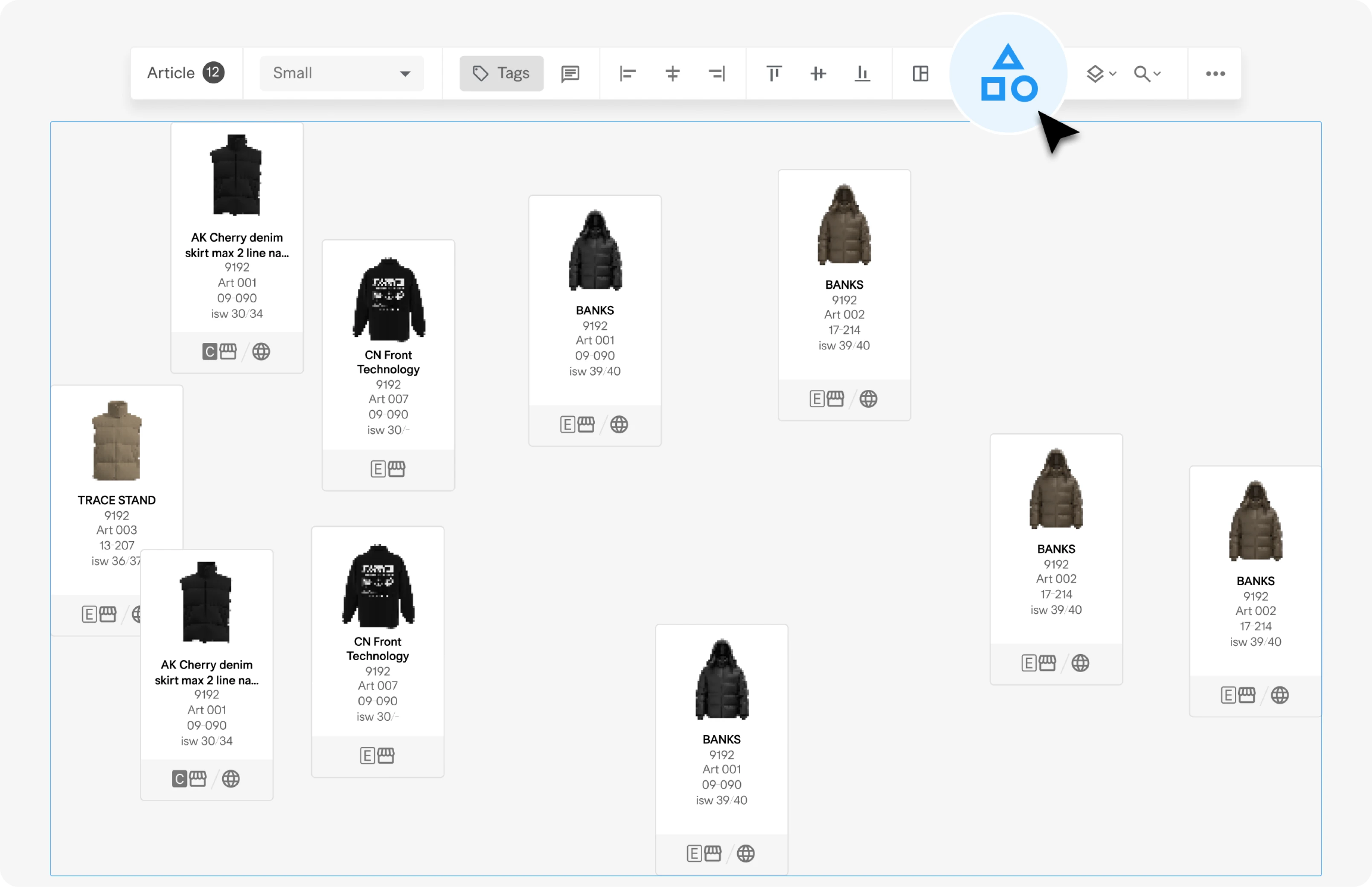
the heart of the application
The article browser had
2 major issues.
The window was too small and it made it hard to browser and find articles.
A smaller window made it quite clunky to browse and view articles. A lot of time was wasted on scrolling and trying to find the right article.
The window overlay took up space on the board that users were working on
The old window also took up space on the canvas that users were working on. This caused friction with users who constantly had to move the window around.
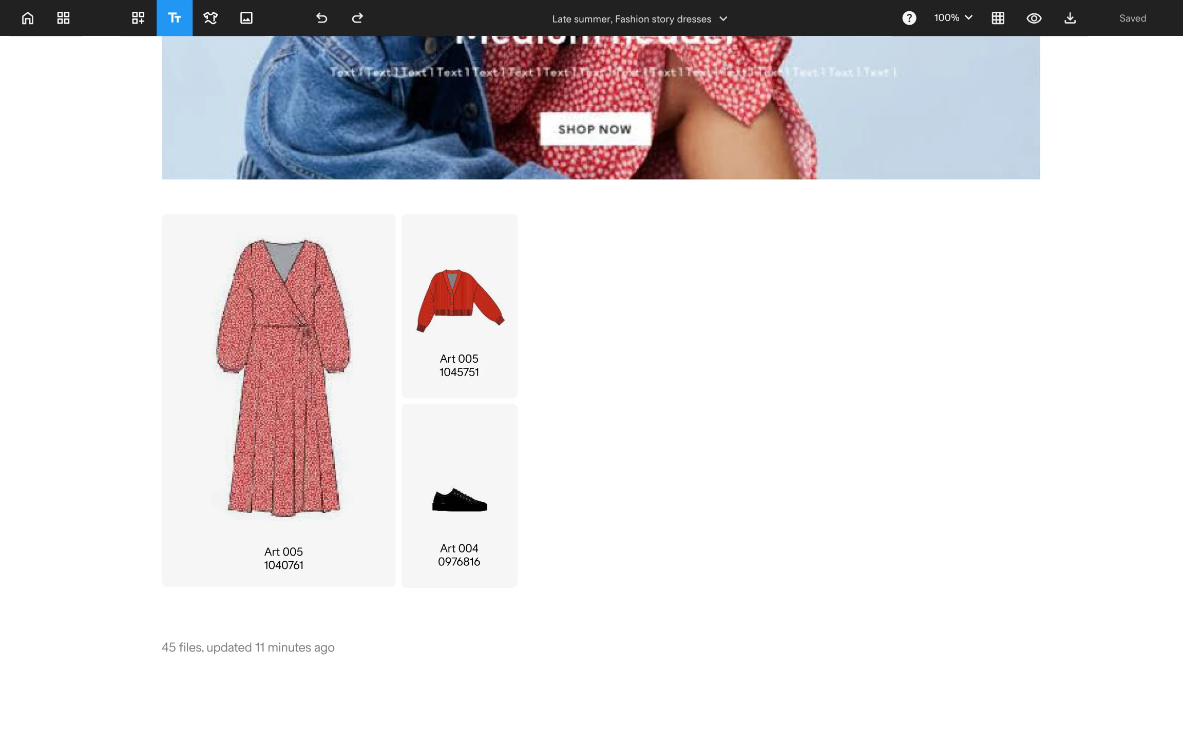
SOLUTION
The redesigned article browser provides more room to explore content, and can be hidden completely for distraction-free board work, providing the best of both worlds.
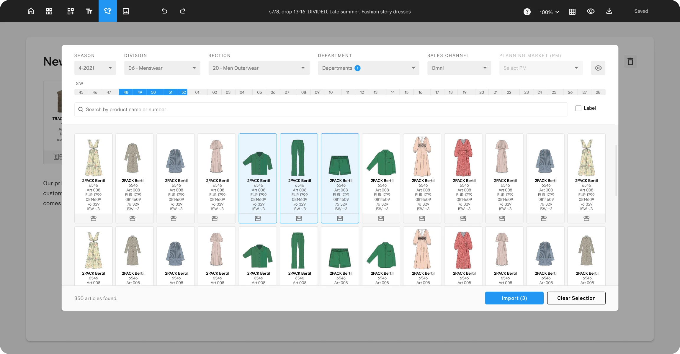
Easier to browser through articles with a larger window
The larger window makes it easy to browse through articles and provides a more relaxed viewing experience.
Enabling users to focus on the board by hiding the browser
With a keyboard shortcut (cmd + k), users can easily show or hide the browser, and focus on the work on the board.
Keyboard shortcut to quickly hide/show article browser
The keyboard shortcut and the quick hide/show mechanism allows users to have complete focus on whatever phase they’re in.
10.Project highlights
Cut down document creation time in half
The new UX and feature set helped users doubled their speed and cut down document creation time in half.
Achieved 100% adoption, despite being optional
Even with an optional rollout, the new app achieved full adoption — 100% of users voluntarily switched from the legacy tool.
Improved performance & loading speed
The new app vastly outperformed the old one in speed and reliability. Loading times of large documents also improved.
Contribution to enterprise design patterns
Enriched the H&M component library.
Increased user
satisfaction
Users were happy with improved workflows, faster speeds and the nicer finishing look of their documents.
Better accuracy and operational efficiency
Providing continuous access to live data streamlined collaboration, decreased errors, and drove gains in operational efficiency.
Tight loop between user feedback & implementation
Short time between customer feedback and implementation meant user requests were catered to quickly