Portfolio of Edwin D’Mello
My role
Concepting
Information architecture
User Experience
In app messaging strategy
Client
Butternut Box
Duration
4-5 months
Team
2 des,
3 devs
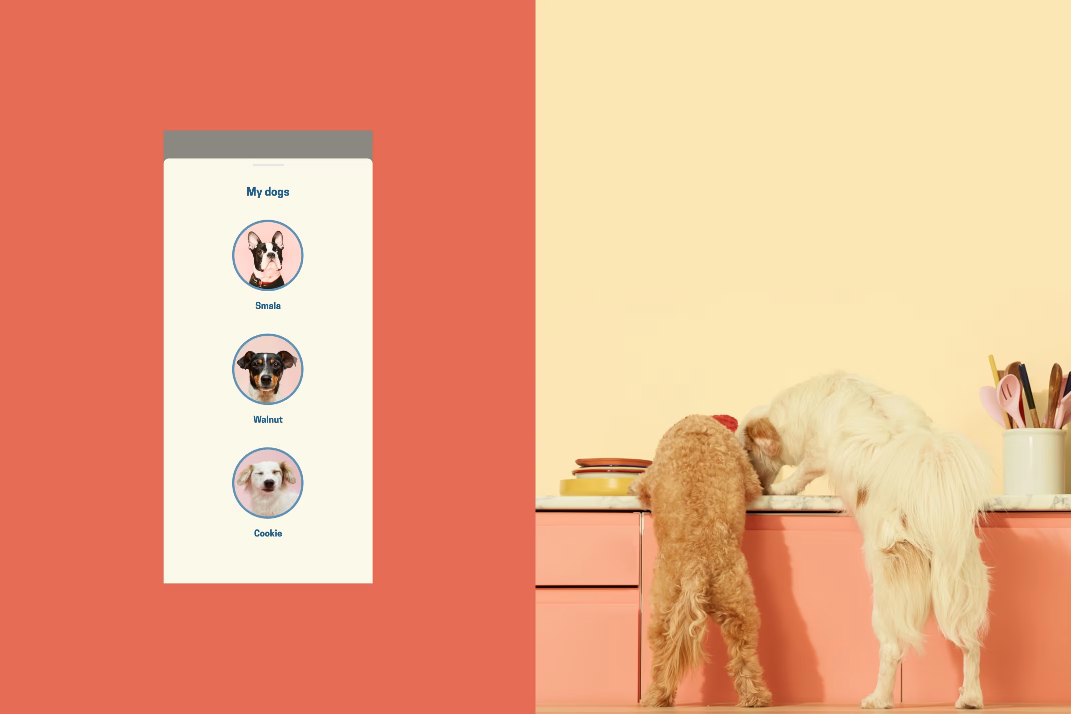
Building a new subscription management app for Butternut Box that allows users to manage the food subscription for their dogs
Butternut box is a company that makes fresh wet dog food that is of really good quality - like it is fit for people to consume, and some customers have a bit of a nibble from their dog food because it smells and tastes great. Anyway, they deliver this fresh food to customers on regular intervals in a box - that being the Butternut Box.
Designing and developing a subscription management app. The majority of the app and Butternut’s service is about managing your subscription to Butternut’s food.
01.
Project Background
The goal of this project was to bring the Butternut experience to a mobile app while fixing the website issues. My role was to focus on UX and provide an excellent experience - no visual design.
Butternut had a web experience that allowed users to manage their subscriptions, their dog’s plans, recipes and details. The goal of this project was to bring the Butternut experience to a mobile app while fixing the website issues.
02.
The most important
challenges
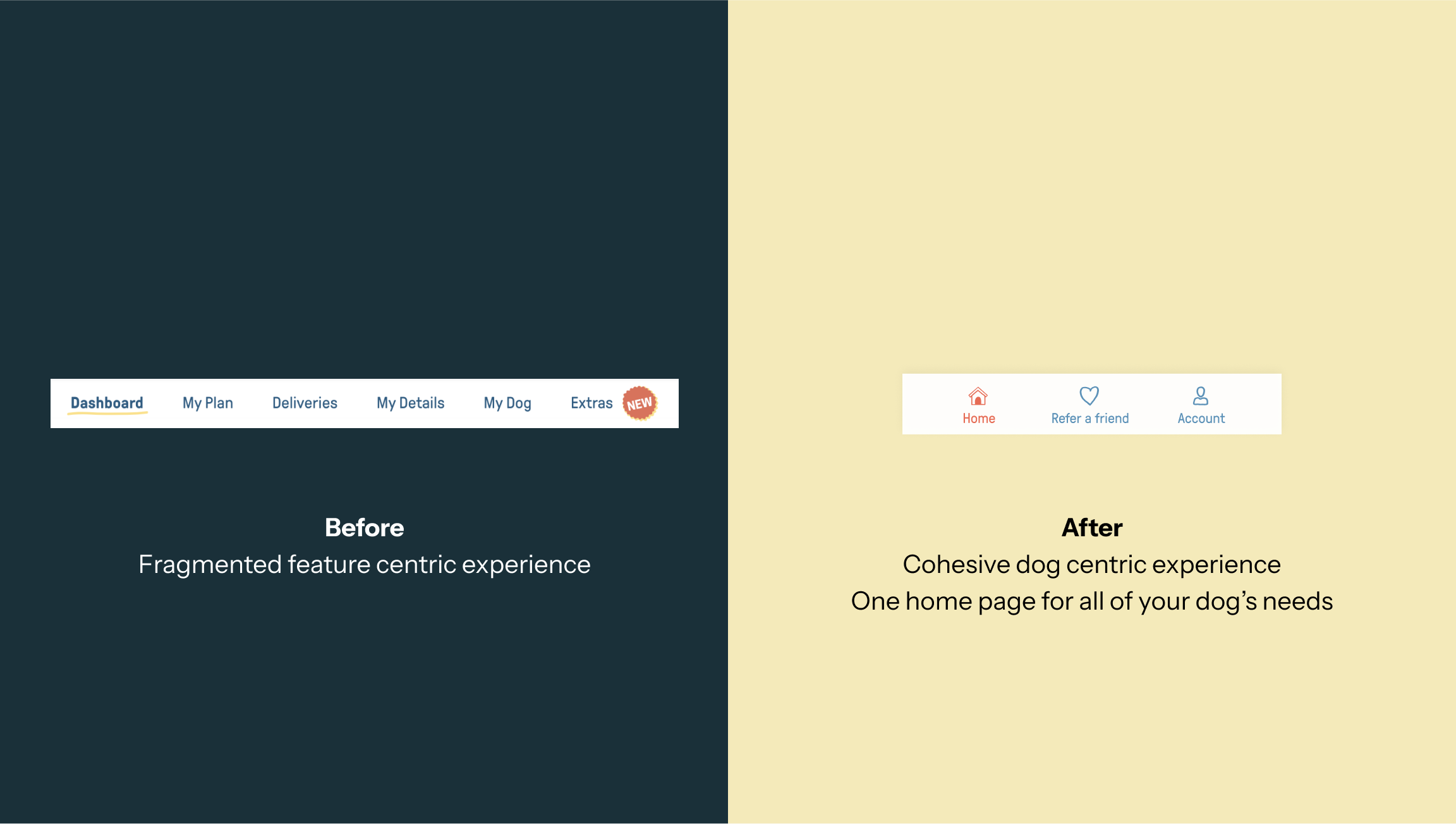
Heavy emphasis on features and not enough on the dog, making it feel transactional, in-cohesive, feature centric experience and a little less meaningful.
Butternut had a great set of features, but the experience was fragemented and centred around providing a bunch of features rather than providing a place to take care of their dogs needs.
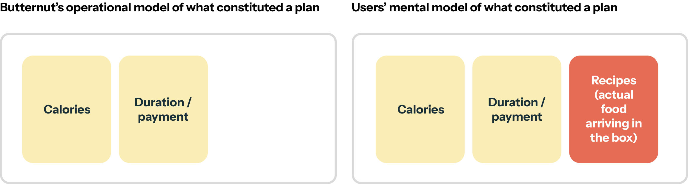
Butternut’s model of what constituted a plan contradicted user’s mental models of what constituted a plan resulting in confusion.
Users sometimes couldn’t find the recipes they wanted to change because they would expect them to be under Plan Management, but they weren’t. This resulted in confusion and being unable to find things.
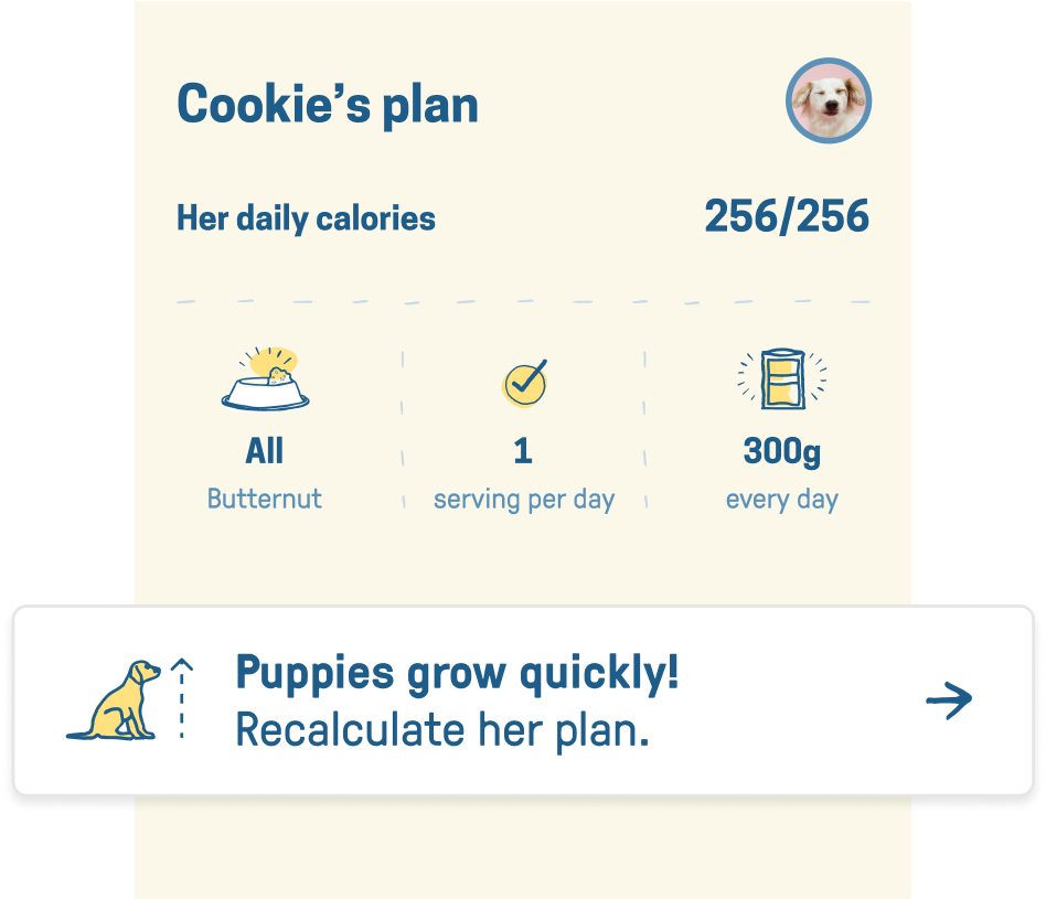
Puppy owners are stressed as their pups are growing quickly and they’re unsure how much food to feed their pups and when to increase the food.
Puppy owners were especially stressed, not knowing how much food to feed their pups, when to increase food quantity, etc. As a brand that projected caring values, the Butternut digital experience was a bit lacking.
03.
Solution
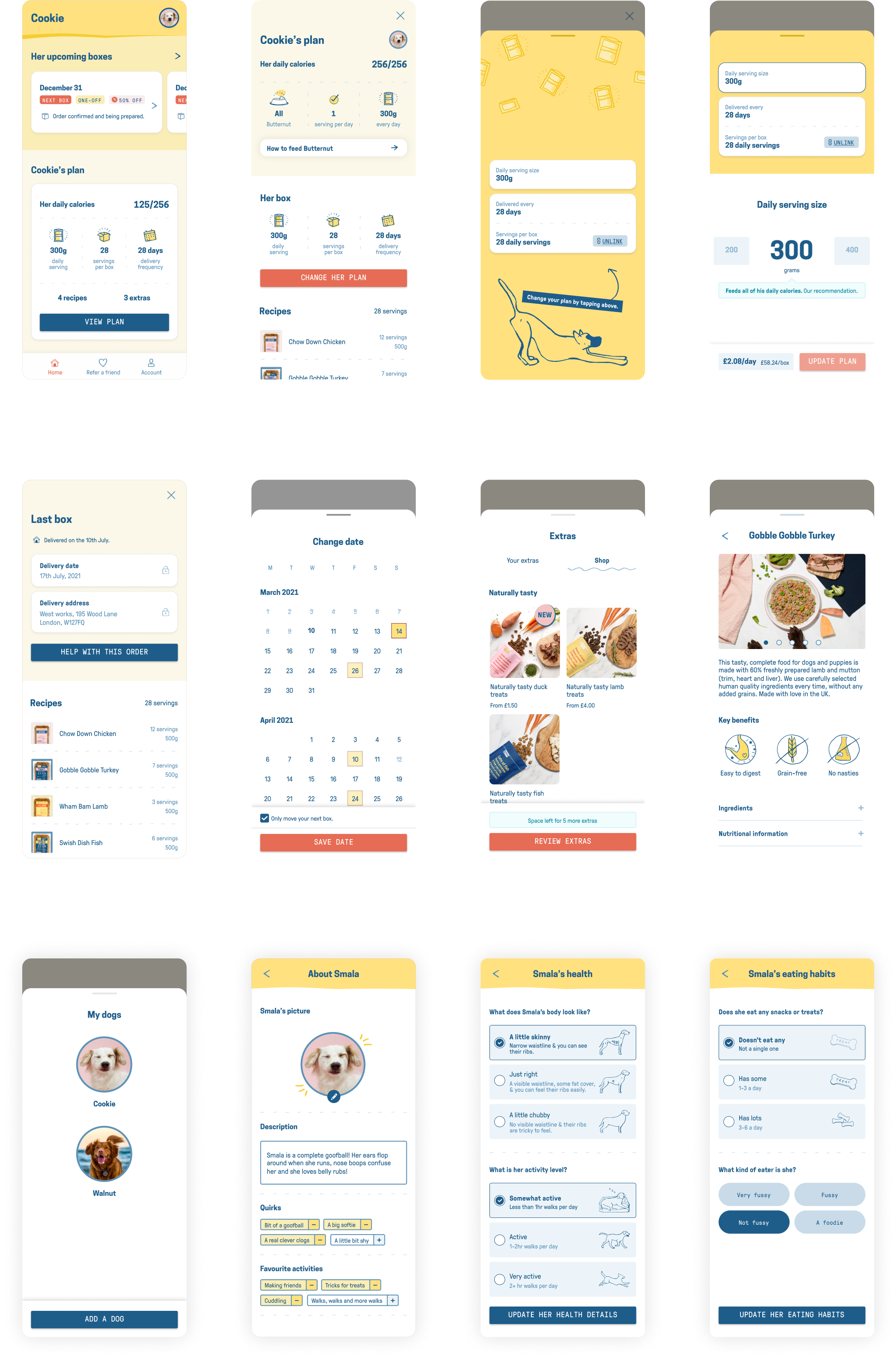
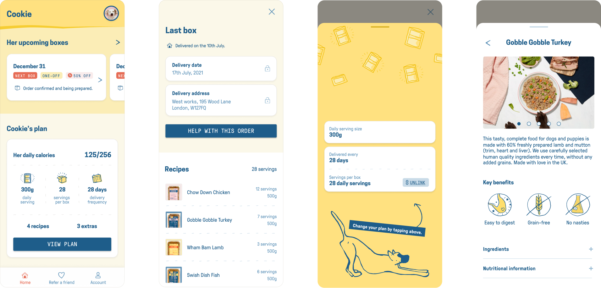
Making the dog the centre of the experience, and bringing together features into a cohesive dog centric experience.
Dog over features
Users don’t compartmentalise dogs in their head, they think about the dog and all of the dog’s needs. We wanted the experience to cater to this, one page for all of your dog’s needs, similar to a fitness app that puts the user at the centre and not the individual features.
04.
Aligning Butternut’s operational model with users’ mental model for greater clarity
The problem
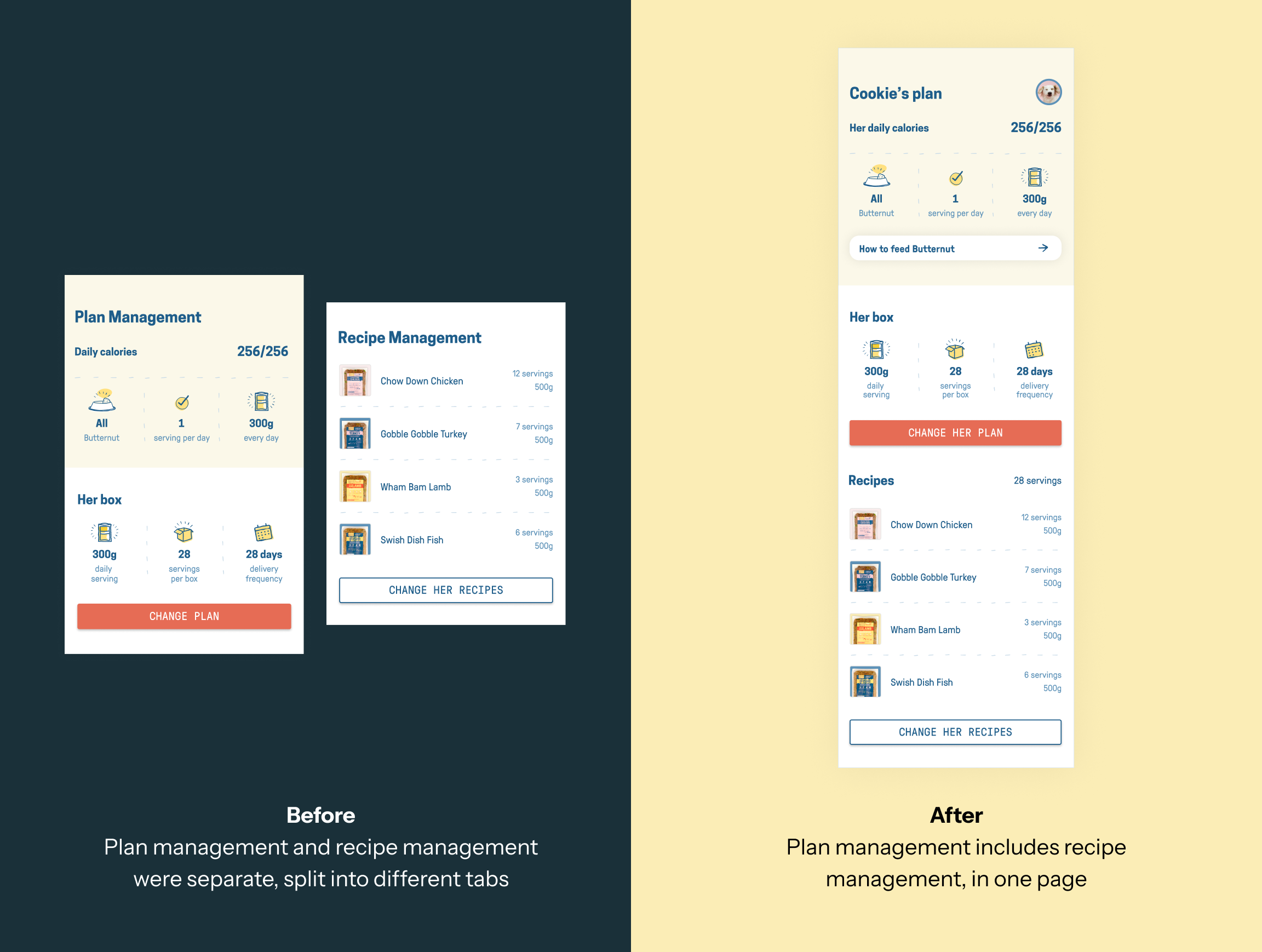
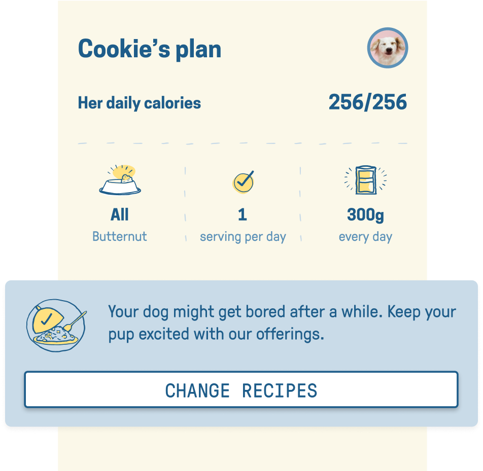
There was a disconnect between Butternut’s operational model and users’ mental model. Butternut saw the recipes as separate from the plan itself, while users expected the entire box, including recipes, to be part of the plan. This led to confusion because users looked for recipe changes under "Plan Management," while the recipes were presented under “Recipe Management”. Finding things users wanted became difficult and led to frustration.
The solution
While operationally these were different features, visually and hierarchically we presented them together to make them seem like the “Plan”, thus aligning with users’ understanding of what constitutes a plan.
05.
The new dog-centric
information architecture
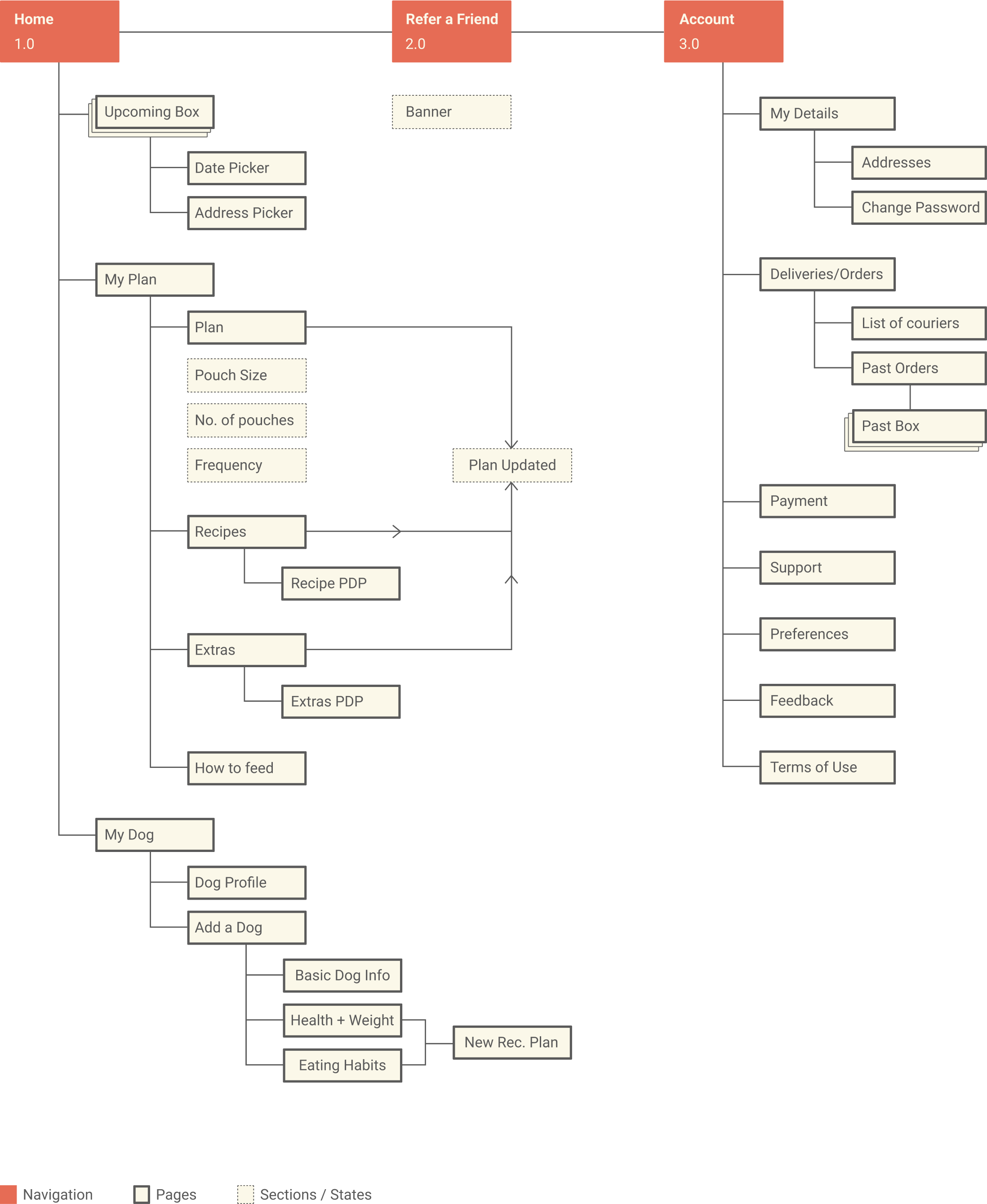
Crux of UX was simplifying information architecture with a focus on the dog and aligning with user’s mental models instead of operational model.
06.
Thoughtful, caring and comforting communication for a uniquely Butternut experience
Informing puppy owners what’s coming to manage their stress
Puppy owners were provided with periodic notifications on the growth of their pups and the resulting new calorie requirements.
Thoughtfully keeping things fresh for dogs if recipes haven’t been changed
Occasional notifications to keep things fresh for the dogs, in line with Butternut’s brand values of being thoughtful and caring.
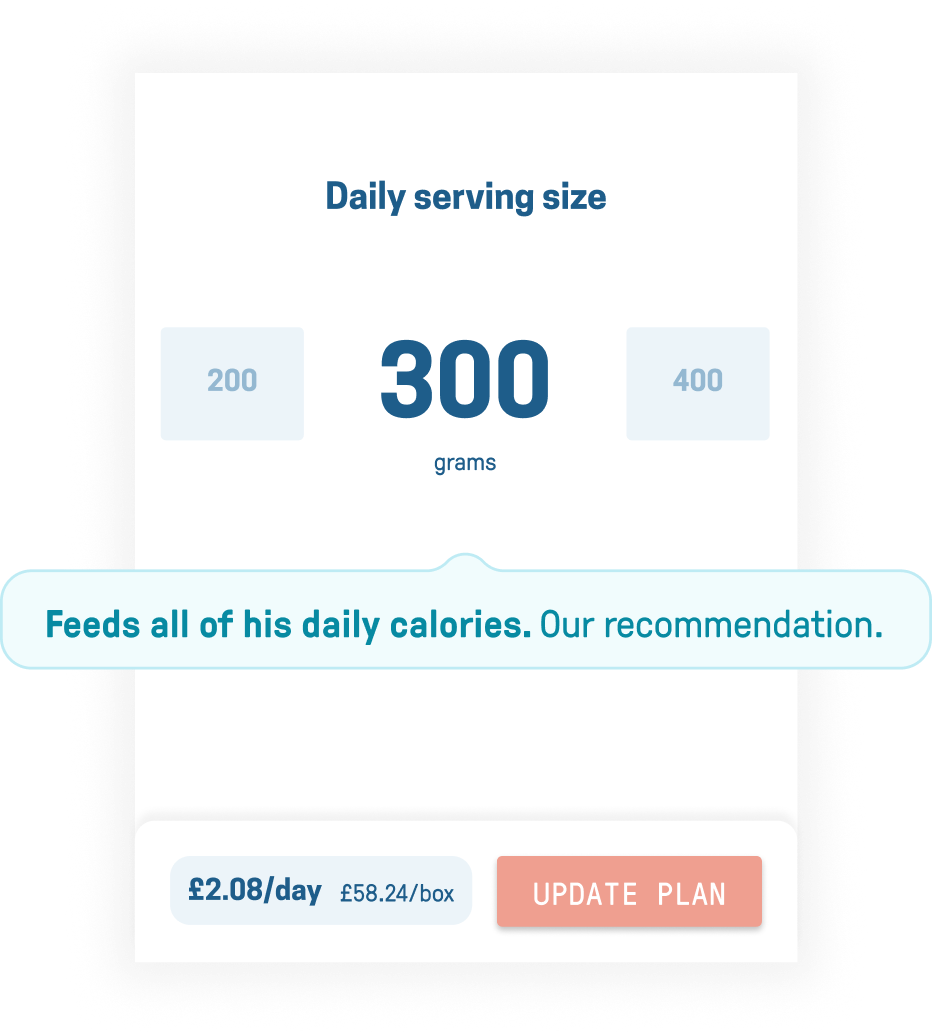
Informing users the effects of the daily serving size they choose for their dogs
Users can customise the daily serving size, but if Butternut feels that this does not match the calories the dog requires, the user will be provided with immediate feedback.
Butternut as a brand is comforting and caring. We wanted to anticipate user’s concerns and stress and add thoughtful communication to make users aware that Butternut is there to help them.