My role
Concepting
Analysing filters
Building out an appropriate user flow
Storytelling
Align storytelling with product tagging
Information architecture
Team 2 des, 2 devs
Client
Adidas
Duration
2 months
A mobile-first product finder for Adidas Outdoor that helps consumers find products to connect with the great outdoors.
During Covid, customers started seeking the great outdoors and looked to Adidas for help. This project was about helping customers find the right gear to connect with the outdoors.
Project highlights
11.3% conversion rate
exceeding industry standard and achieving fewer abandoned shopping carts in the process.
60 seconds
Total time it takes for a customer to complete the journey
Extended to other departments
The success of the product finder resulted in the product finder being expanded to jackets, running and bras.

AVA Digital Awards 2021 - Mobile Buying Experience
Multiple touchpoints
The experience was created for the adidas mobile app, e-commerce site and brick and mortar stores
82%
Of users complete the experience in the adidas app
Web Awards 2021 -
Design Standard of Excellence,
Mobile Standard of Excellence
Project highlights
01.
Project Background
As the pandemic confined most of our lives indoors, many of us began to seek safer ways to explore the outdoors. We returned to nature.
Many people who had never had the time or opportunity to explore the outdoors before, suddenly sought out new adventures in forests, trails and mountains. Beginners needed tips on tried-and-tested equipment to support them in everything from hiking and long-distance running to climbing. They turned to adidas, one of the world’s most respected athletic wear brands, for help.
The goal of this project was to help consumers connect with the right gear to help them experience the great outdoors.

02.
The most important
challenges
The website had too many filters, making it difficult to narrow down choices and harder for users to make decisions.
Too many filters created noise rather than clarity. Users couldn’t easily narrow their choices, resulting in slower decisions, inability to find the right products and unnecessary friction in the shopping experience.
CHALLENGE 01.
How might we facilitate decision making without overwhelming users with choice?
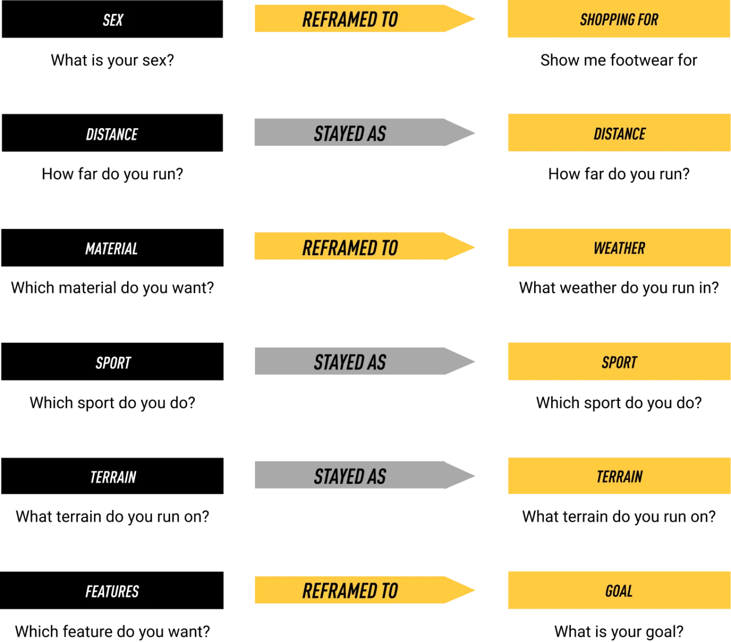
Filters were labelled with tech terms rather than user needs, making it unclear which options were relevant.
Because filters were labelled with technical terminology instead of user-oriented language, shoppers struggled to understand what some of them meant. This made it harder to narrow down choices and find the right product.
CHALLENGE 02.
How might we make filters more relatable and understandable to aid understanding?
The product listing page presented a wall of items with no real guidance, forcing users to determine what suited them.
With no guidance or contextual support on the product listing page, users were left to interpret a long wall of items on their own. This lack of direction made it harder to narrow down choices and find the right product.
CHALLENGE 03.
How might we provide users guidance instead of letting them browse a meaningless list?
03.
Distilling filters down to the bare essentials
We focused on simplifying the filter set by prioritising the options that aligned most closely with users’ core needs. Instead of overwhelming people with flashy technologies and obscure features that added little value, we distilled the system down to the filters that genuinely supported decision-making. This helped create a more intentional, user-friendly filtering experience.

04.
Reframing and translating filters
into more human language
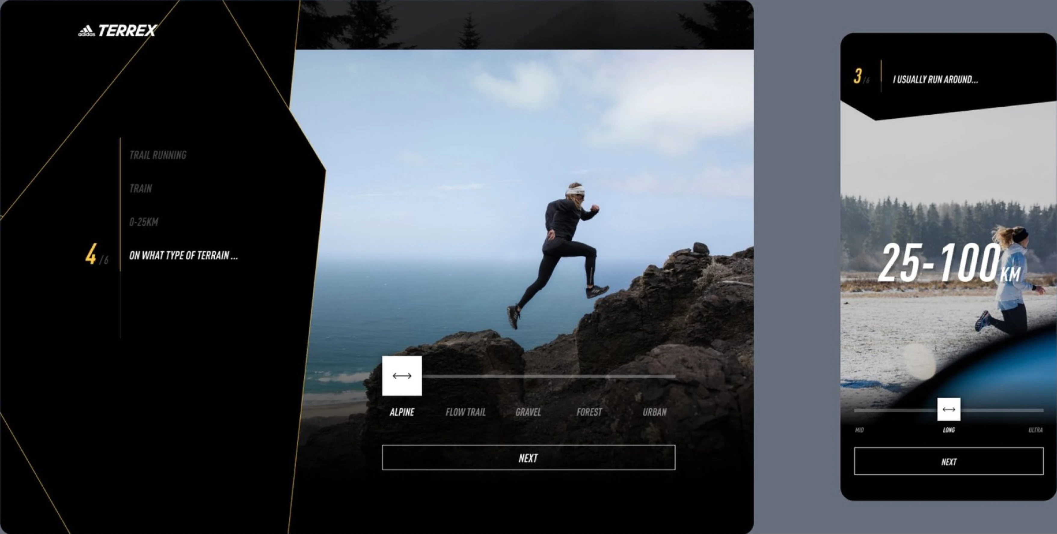
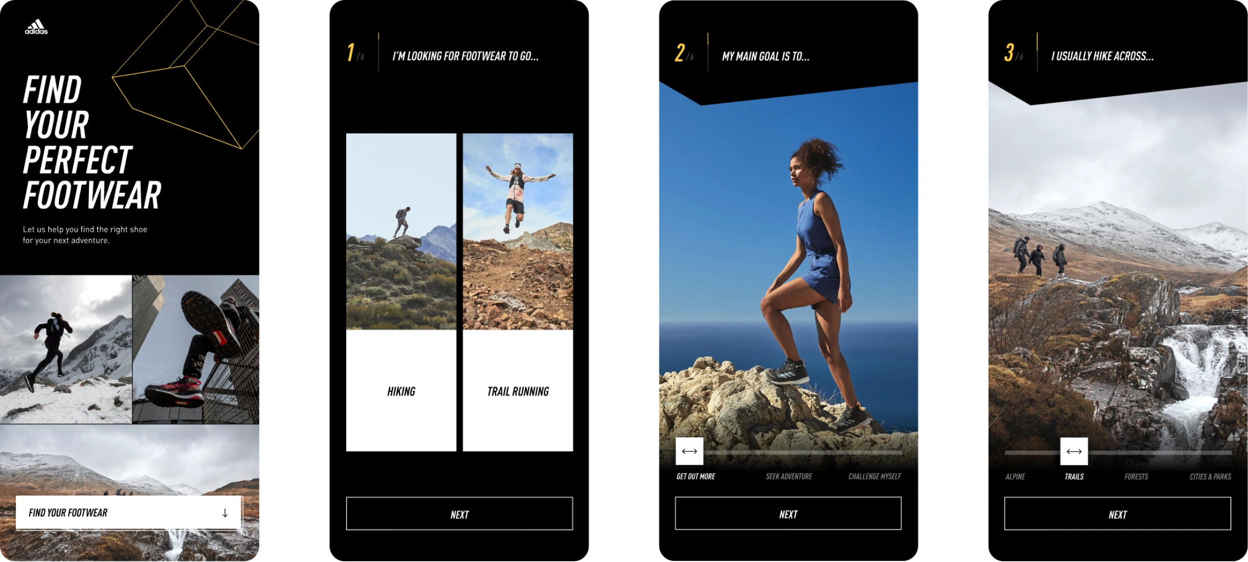
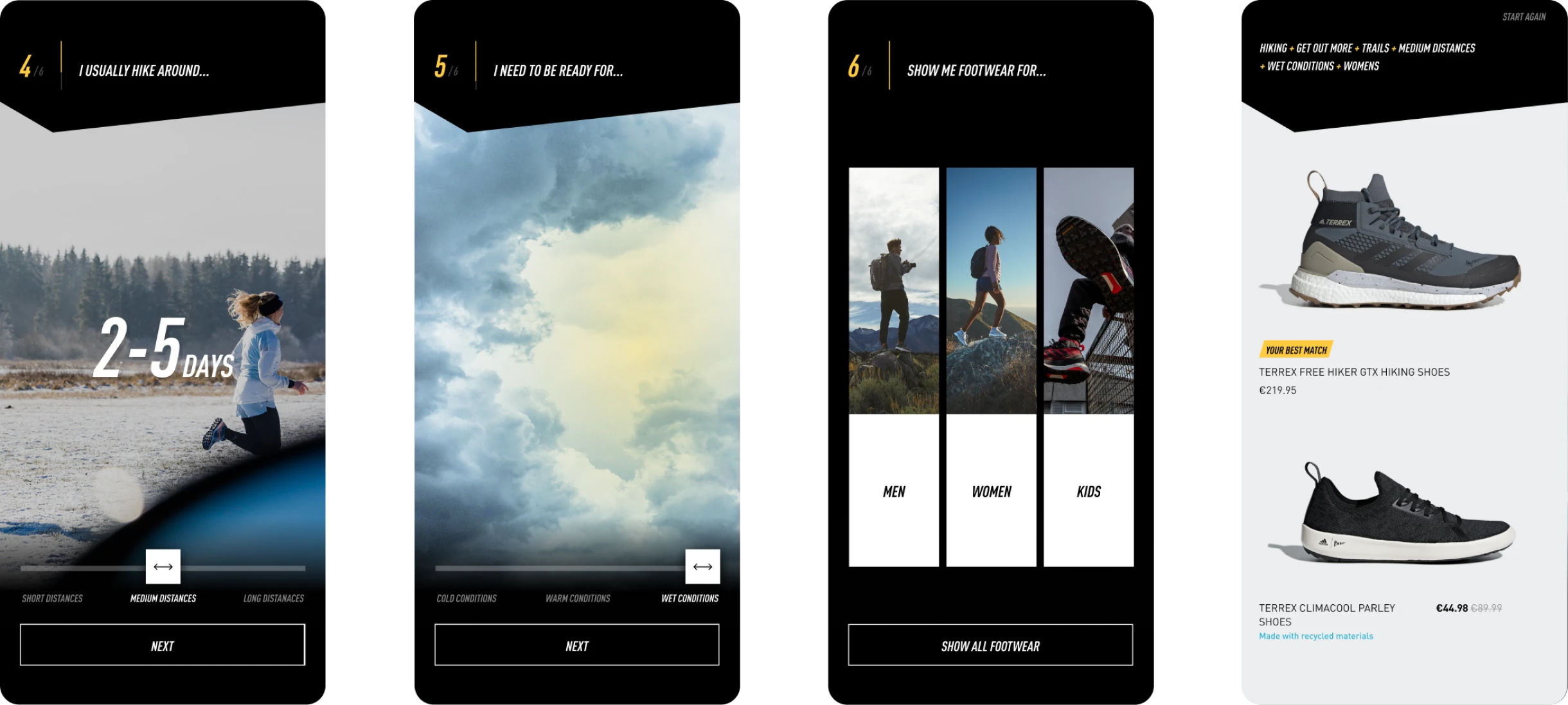
We reframed and translated the filters into a more human language with an emphasis on human behaviour and use, rather than technical terms and features. We did so in order to aid understanding, story telling, and to connect and relate to peoples’ lives better.
05.
Concept
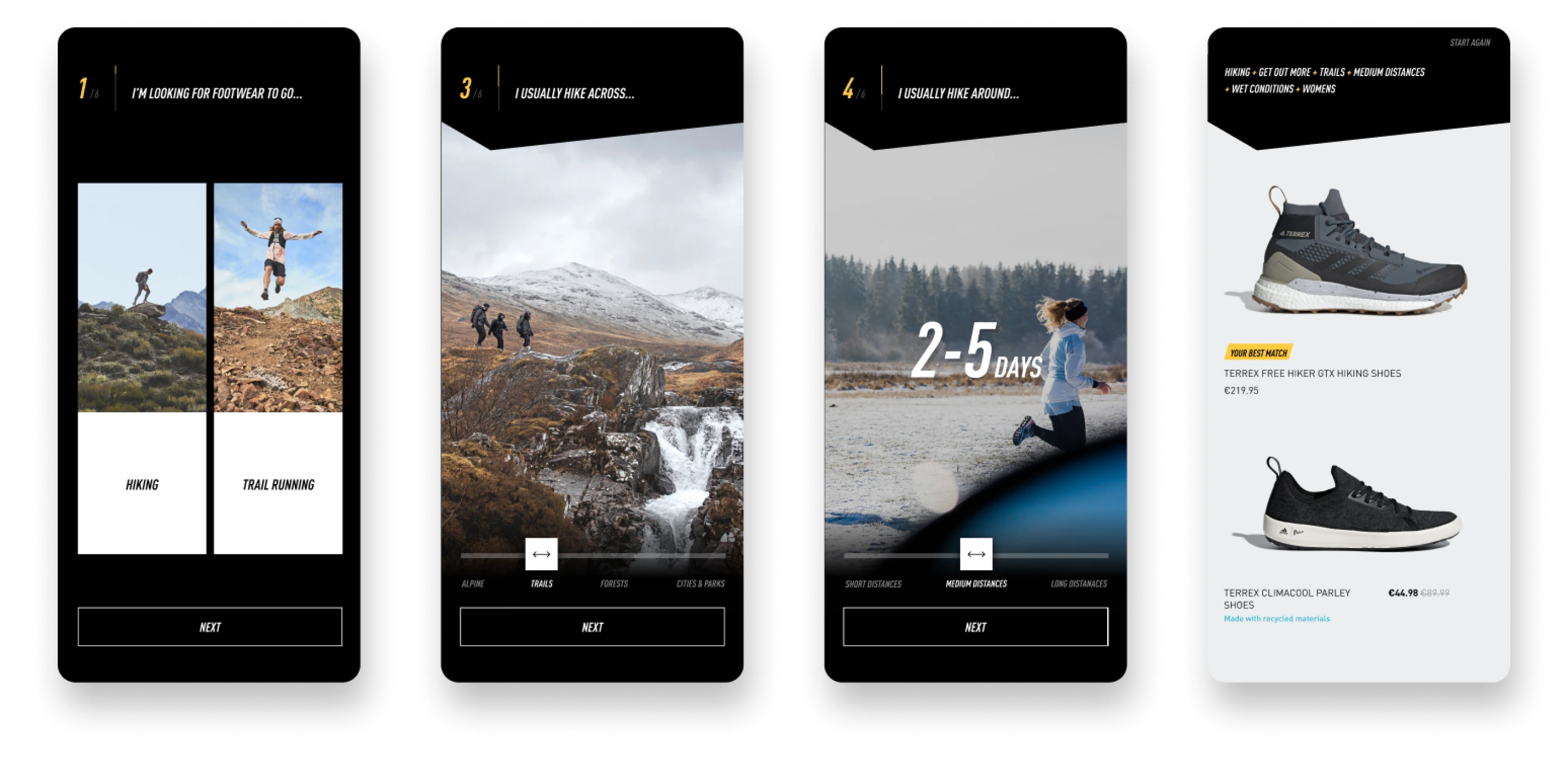
A digital assistant designed to mirror the guidance of an in-store expert: simplifying options, presenting them in digestible pieces, and tying everything together in a cohesive narrative that helps users decide with confidence.
Limit choices, make meaningful
From an overwhelming number of choices, we distilled it down to the most essential meaningful ones needed to make a decision, just like a store assistant would. Limiting choices made it easier for users to find a product.
Information in small digestible chunks
We provide the information progressively, in small easy digestible chunks to aid understanding and stop the user from being overwhelmed, like an expert sales person guiding you to what’s best.
Simple narrative focussed on needs
We built a simple narrative focussed on human needs in the outdoors rather than features & technologies gone into producing a garment. Connection with user needs than advertising/technical jargon
06.
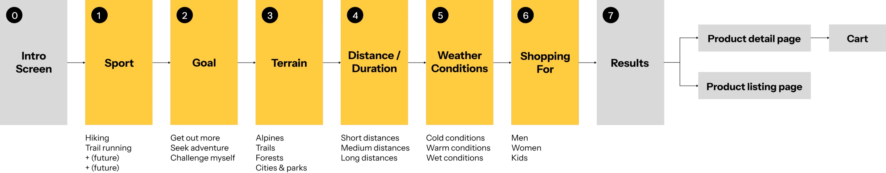
User flow
07.
Design

We aimed to create an experience that behaved like a great salesperson — simplifying choices, presenting information in digestible steps, and connecting everything through a clear, compelling narrative that supported confident decision-making.
08.
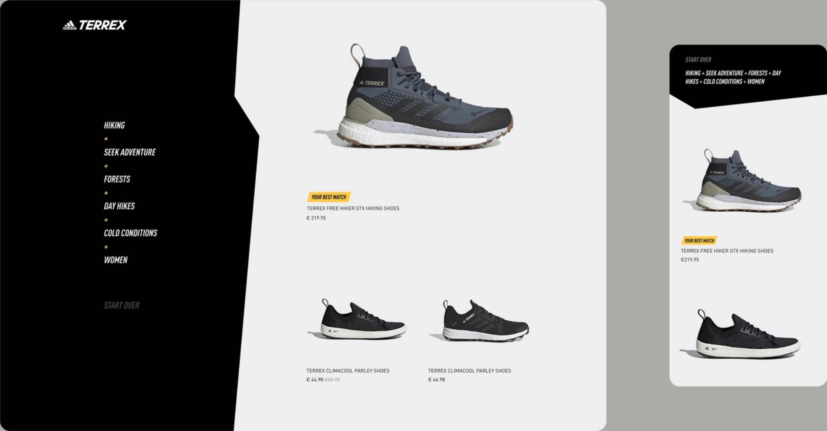
Recommended page over listing page
We introduced the new recommended page towards the end of the journey. The recommended page was meant to provide a curated list of products best suited to the user rather than the listing page of 20 products.
09.Project outcome
11.3%
conversion rate exceeding industry standard. Fewer abandoned shopping carts.
25%
bounce rate, lower than industry standard
Extended to other departments
The success of the product finder resulted in the product finder being expanded to jackets, running and bras.
82%
Of users complete the experience
in the adidas app
31,000
unique visitors
10.Awards
AVA Digital Awards 2021 - Mobile Buying Experience
Web Awards 2021 -
Design Standard of Excellence, Mobile Standard of Excellence